


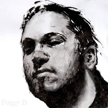
Hey there. I have a work in progress here and I would very VERY much appreciate any crits or comments. Darker or lighter? Texture or no texture? Texture doesnt show up too well in this small version.. It just looks messy. I'll take it down and replace it with the final after thesis is over. Thankyou!
1 comment:
Yo Dave. Looks good. I think I prefer having that solid dark in there, to me the grayed out figure just makes the whole picture lose its substance as something that is painted. It starts looking more like a pencil drawing with those lighter darks.
Given the the deadline, it looks like all you really need to do is finish the rendering on the monster hand. And add some hint of form to the front figure's coat. You really can leave most of that coat as a big dark shape and only do some subtle rendering to give it more form. Also a texture could give the coat a bit more interest.
Look at any old master and how they handled black clothing and you will see how they managed to keep it a big, simple shape while still making it read as an object with volume. Rembrandt and Sargent are good places to start. Might as well go right to the best.
Post a Comment